ShopDreamUp AI ArtDreamUp
Deviation Actions


![Reaper - Necromancer [Animation]](https://images-wixmp-ed30a86b8c4ca887773594c2.wixmp.com/f/2d07ac85-3545-4e3e-8366-c598729eb8f9/dforntn-e5ffd732-769a-4c20-91f2-5d33a00cd308.gif/v1/crop/w_184,h_184,x_0,y_5,scl_0.38493723849372,q_85,strp/reaper___necromancer__animation__by_gornik6_dforntn-92s-2x.jpg?token=eyJ0eXAiOiJKV1QiLCJhbGciOiJIUzI1NiJ9.eyJzdWIiOiJ1cm46YXBwOjdlMGQxODg5ODIyNjQzNzNhNWYwZDQxNWVhMGQyNmUwIiwiaXNzIjoidXJuOmFwcDo3ZTBkMTg4OTgyMjY0MzczYTVmMGQ0MTVlYTBkMjZlMCIsIm9iaiI6W1t7ImhlaWdodCI6Ijw9NTI2IiwicGF0aCI6IlwvZlwvMmQwN2FjODUtMzU0NS00ZTNlLTgzNjYtYzU5ODcyOWViOGY5XC9kZm9ybnRuLWU1ZmZkNzMyLTc2OWEtNGMyMC05MWYyLTVkMzNhMDBjZDMwOC5naWYiLCJ3aWR0aCI6Ijw9NDc4In1dXSwiYXVkIjpbInVybjpzZXJ2aWNlOmltYWdlLm9wZXJhdGlvbnMiXX0.KFnXxNptjmB6j3lVa4DA0SxCr0Cgd7_HYMJX-Nql2Ns)
![Reaper - Necromancer [Animation]](https://images-wixmp-ed30a86b8c4ca887773594c2.wixmp.com/f/2d07ac85-3545-4e3e-8366-c598729eb8f9/dforntn-e5ffd732-769a-4c20-91f2-5d33a00cd308.gif/v1/crop/w_92,h_92,x_0,y_2,scl_0.19246861924686,q_85,strp/reaper___necromancer__animation__by_gornik6_dforntn-92s.jpg?token=eyJ0eXAiOiJKV1QiLCJhbGciOiJIUzI1NiJ9.eyJzdWIiOiJ1cm46YXBwOjdlMGQxODg5ODIyNjQzNzNhNWYwZDQxNWVhMGQyNmUwIiwiaXNzIjoidXJuOmFwcDo3ZTBkMTg4OTgyMjY0MzczYTVmMGQ0MTVlYTBkMjZlMCIsIm9iaiI6W1t7ImhlaWdodCI6Ijw9NTI2IiwicGF0aCI6IlwvZlwvMmQwN2FjODUtMzU0NS00ZTNlLTgzNjYtYzU5ODcyOWViOGY5XC9kZm9ybnRuLWU1ZmZkNzMyLTc2OWEtNGMyMC05MWYyLTVkMzNhMDBjZDMwOC5naWYiLCJ3aWR0aCI6Ijw9NDc4In1dXSwiYXVkIjpbInVybjpzZXJ2aWNlOmltYWdlLm9wZXJhdGlvbnMiXX0.KFnXxNptjmB6j3lVa4DA0SxCr0Cgd7_HYMJX-Nql2Ns)


Description
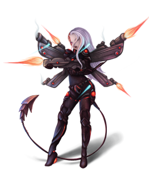
My little cyborg for round 2 of the Race Smackdown. I love this character, and in this round the requirement is to make her look like she is in battle, so she is outfitted with her killing armor! Complete with cybernetic wings with guns. Lots and lots of guns.
Base is by ~TheHWord
Base is by ~TheHWord
Image size
300x350px 111.38 KB
Comments21
Join the community to add your comment. Already a deviant? Log In
Very awesome design and those guns and the suit are very cyber tech xD